Work
EN FR
Case Study · Nexabank (UX Design Institute brief) · 2023 · 8 min read

A bank should feel human without feeling unserious.

A complete challenger-bank project, from naming the company and designing the logomark to a full identity system and a responsive product UI. One brand decision, propagated across every screen and breakpoint.

Client
Nexabank (UX Design Institute brief)
Role
Brand & UI Designer
Year
2023
Disciplines
Brand IdentityUI DesignDesign SystemsResponsive DesignFintech
A bank should feel human without feeling unserious.

Banking apps have to solve a contradiction.

Feel human and modern, or nobody downloads you. Feel safe and serious, or nobody trusts you with their money. Lean too far either way and you lose: too cold and it feels like a 2009 banking portal, too playful and it feels like a toy you wouldn't trust with your salary.

Nexabank is a challenger bank I built to sit exactly on that line. I wanted a project that was complete, not a styling exercise on someone else's brand, but the whole thing: name the company, design the logomark, build the identity system, then design the product on top of it. Brand visuals and UI as one coherent piece, the way it actually works when you launch something.

A note on scope. This was the final assignment for the UX Design Institute's Professional Certificate in UI Design. The course provides an assignment brief and assesses execution: brand, layout, typography, colour, iconography, and the final interface. The name "Nexabank," the logomark, the identity system, the design system, and the full responsive UI are mine. I came to the certificate with more than a decade of professional experience and used it to build the one thing my portfolio didn't have: a project that runs from brand name to shipped screen, all of a piece.

Three territories, one hierarchy

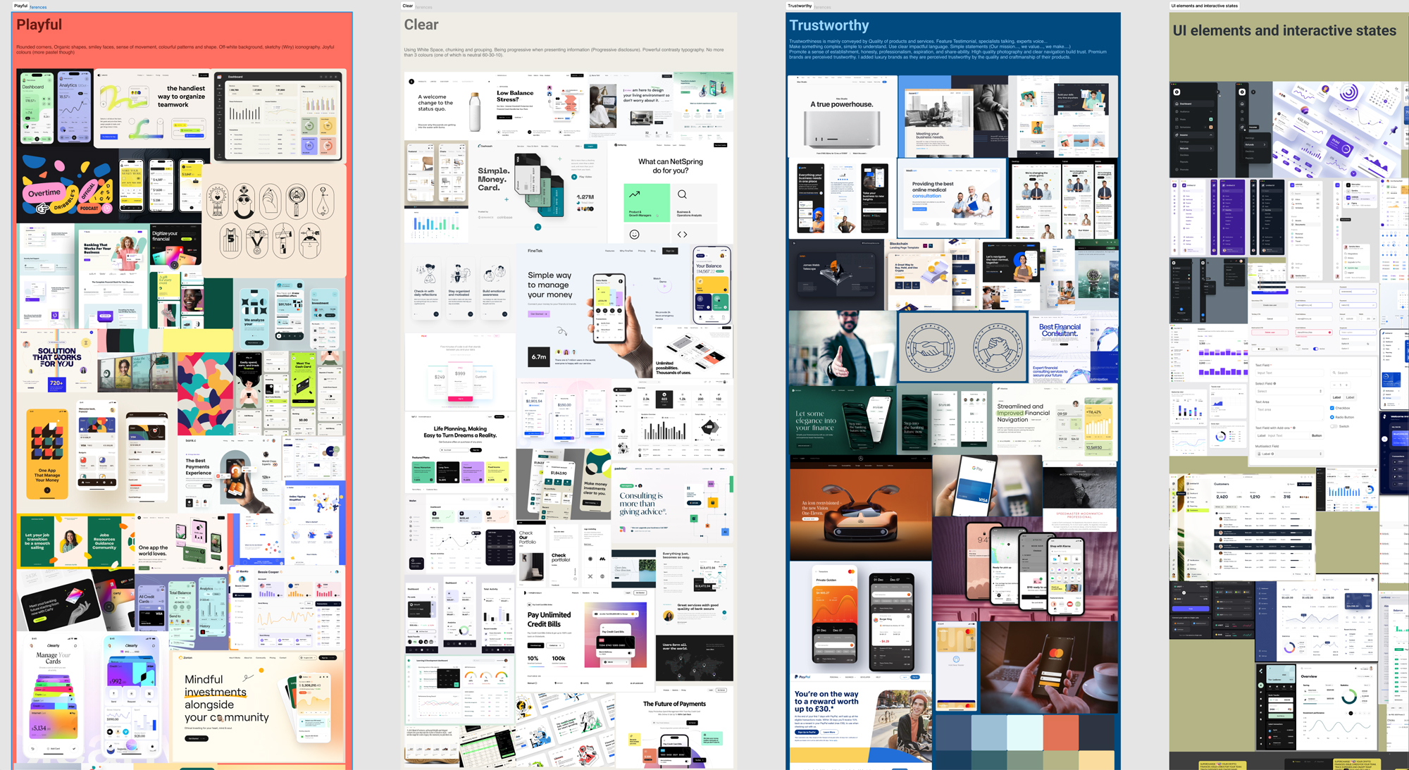
Before any pixels, I had to decide what kind of bank this was going to feel like. I framed it as three competing brand territories and pulled references for each.

Trustworthy. Clarity and whitespace, because clutter reads as anxiety when it's your money on screen. Predictable navigation, so nobody hunts for the transfer button. Crisp, legible typography with tabular figures so digits align cleanly down a list of transactions.

Clear. Restraint. Calm. The information architecture doing the work so the interface doesn't have to shout.

Playful. Rounded geometry for friendliness. Delightful micro-interactions as small rewards. Conversational copy ("looks like you need a bit more in your account to do this" instead of "insufficient funds"). Vibrant accent colour for categories and savings goals.

The naive move is to split the difference and land in the middle, which produces a bank that's mildly friendly and mildly serious and memorable as neither. I didn't do that. I made a hierarchy.

Three brand-territory moodboards, Trustworthy, Clear, and Playful, with annotated references

The decision, and the brand

The decision that drives the whole project: trust is the substrate, play is the accent, and the accent never undermines the substrate.

Trustworthy isn't one of three options I balanced. It's the foundation everything sits on. Clarity, whitespace, predictable navigation, tabular figures, those are non-negotiable, because they're what makes an app feel safe to hold money. Playful is a controlled layer applied on top: rounded geometry, a warm accent, human copy. Never the structure, always the surface. As my own colour note put it, the palette needed a playful touch "without being too overwhelming or screamy for a banking app." That line is the whole philosophy. I knew exactly where the edge was, and I designed up to it without crossing it.

Then I built the brand that encodes that decision.

The name. Nexabank. I needed a name that sounded modern and connective without sounding like a fintech parody. "Nexa" suggests next, nexus, connection; "bank" keeps it grounded and legible. Trust as the noun, modernity as the modifier, the brand decision in the name itself.

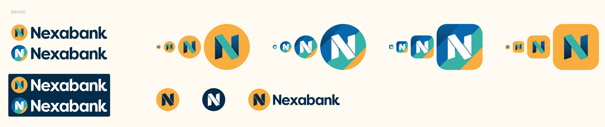
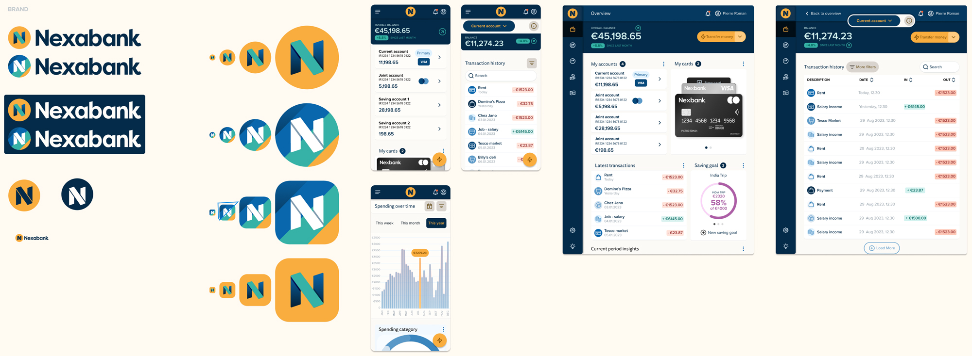
The logomark. I designed the mark from scratch: a bold geometric "N" with a long-shadow treatment that gives it depth and a touch of motion, friendly without being frivolous. It works as a wordmark lockup, as a standalone monogram, and as an app icon across multiple background treatments and sizes, the responsive identity worked out before the product, not after.

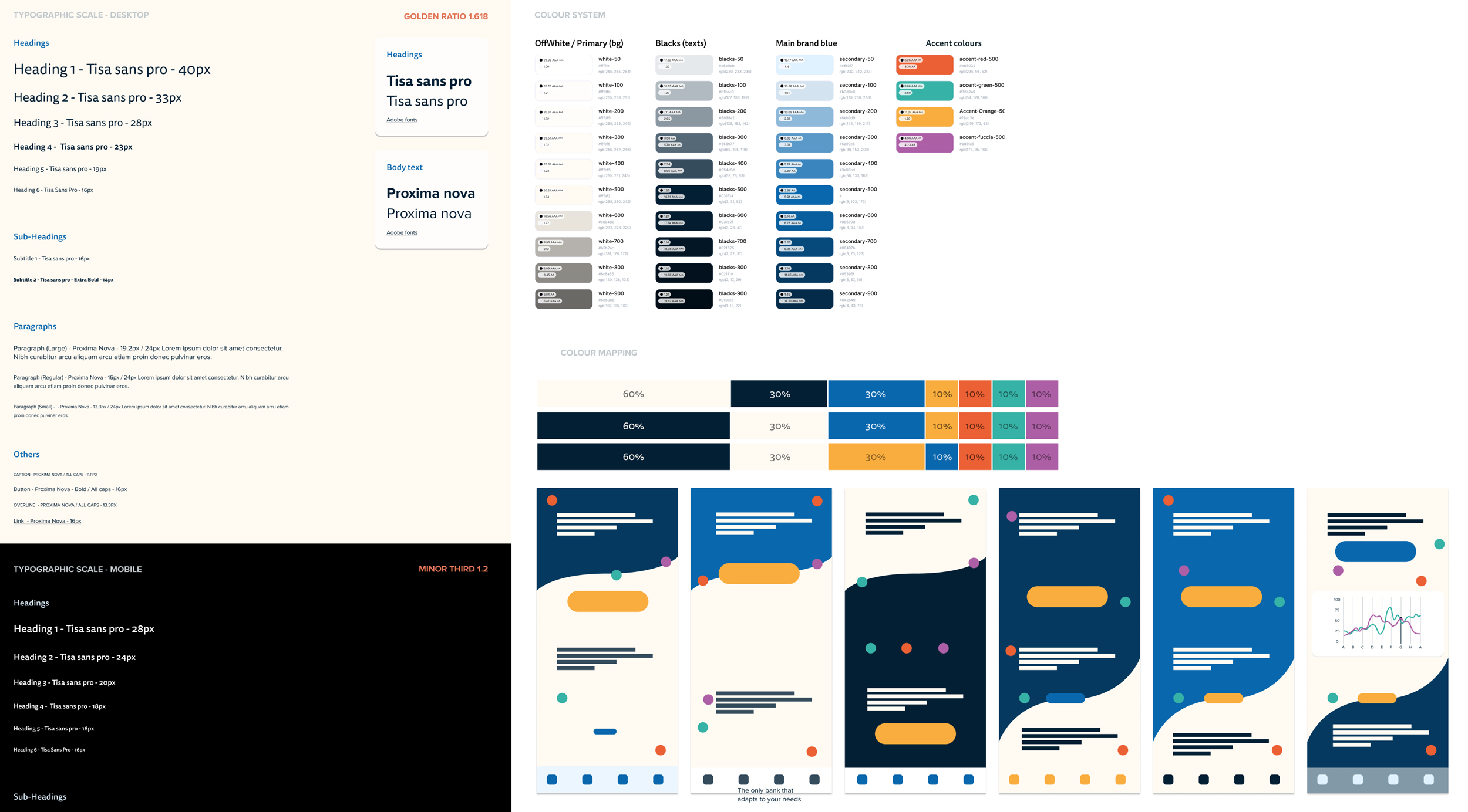
The systems that carry it. A type scale built on a golden-ratio progression for the desktop hierarchy and a minor-third scale for mobile, paired (FF Tisa Sans Pro and Proxima Nova) for legibility and tabular alignment. A structured colour system with a disciplined accent set deliberately confined to categories, savings, and primary actions, never the chrome. A duotone icon set with thick rounded outlines, in my note, "playful but balanced with the trust a bank must convey."
STAGE 01

A logomark that scales before the product does

The problem
A brand mark that looks good once, on a title slide, is useless. It has to survive being a favicon, an app icon, a monogram, and a full lockup, all without losing its identity.
The method
I designed the Nexabank N as a geometric mark with a long-shadow treatment, then worked out every variant up front, wordmark lockup, standalone monogram, and app-icon versions across multiple background treatments and sizes. The mark was proven responsive before a single product screen existed.
I own
The name, the mark, and every variant. The decision to treat the identity as a responsive system from the start rather than a logo I'd resize later and hope for the best.
The result
A brand mark that holds its character from a 16px favicon to a full-screen splash, the foundation the product could be built on without the brand fraying at the edges.
Nexabank logomark in wordmark, monogram, and app-icon variants across sizes and backgrounds
STAGE 02

A type and colour system that encodes the decision

The problem
A brand philosophy is just a sentence until the system enforces it. Trust-as-substrate, play-as-accent has to be true in the type scale and the colour rules, not just the moodboard.
The method
I built a type scale on a golden-ratio progression for desktop and a minor-third for mobile, paired for legibility and tabular figures so balances align. The colour system keeps a calm neutral base and confines a disciplined accent set to categories, savings goals, and primary actions, the playful layer, applied with discipline, never to the navigation or structure.
I own
Every scale value, the pairing logic, and the rule that the accent earns its place only where delight is appropriate and never where it would undercut trust.
The result
A system where the brand decision is structurally true. You couldn't misuse it into feeling toy-like without breaking the rules on purpose.
Type scale and colour system showing accent colour confined to categories and actions
STAGE 03

A product that wears the brand at every size

The problem
A design system is only proven when it survives real screens at real breakpoints. The product had to feel like Nexabank on a wide desktop, a tablet, and a phone, with the layout decisions changing intelligently, not just reflowing.
The method
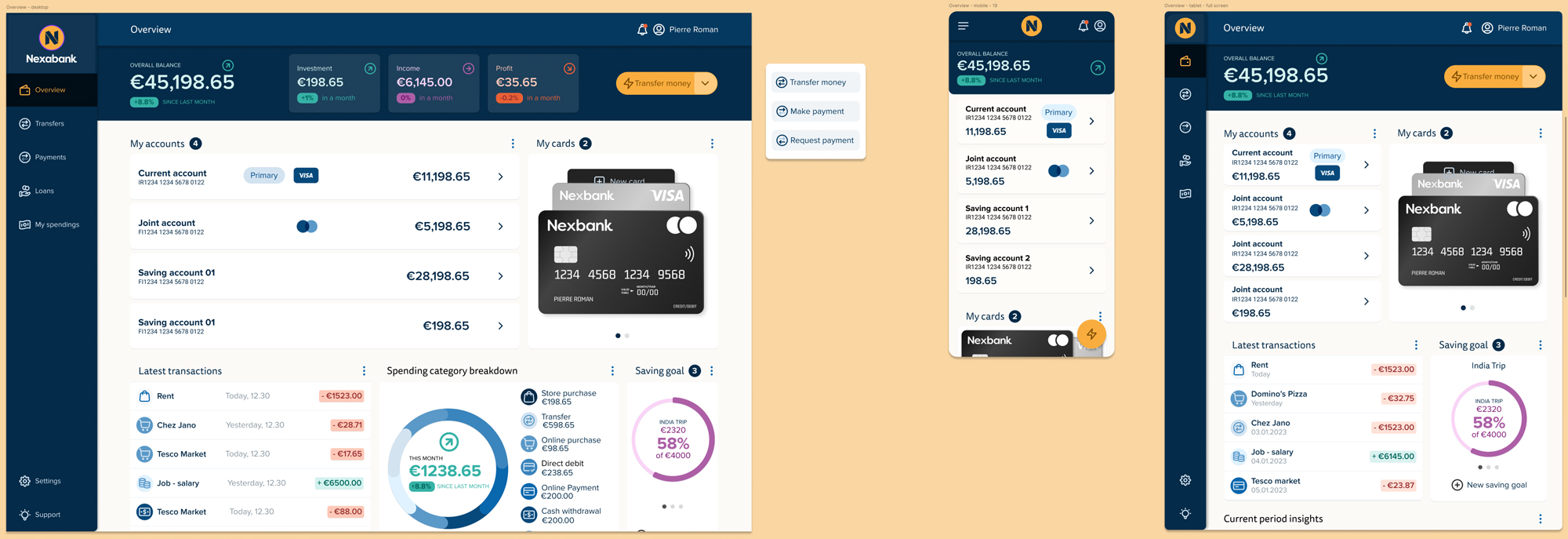
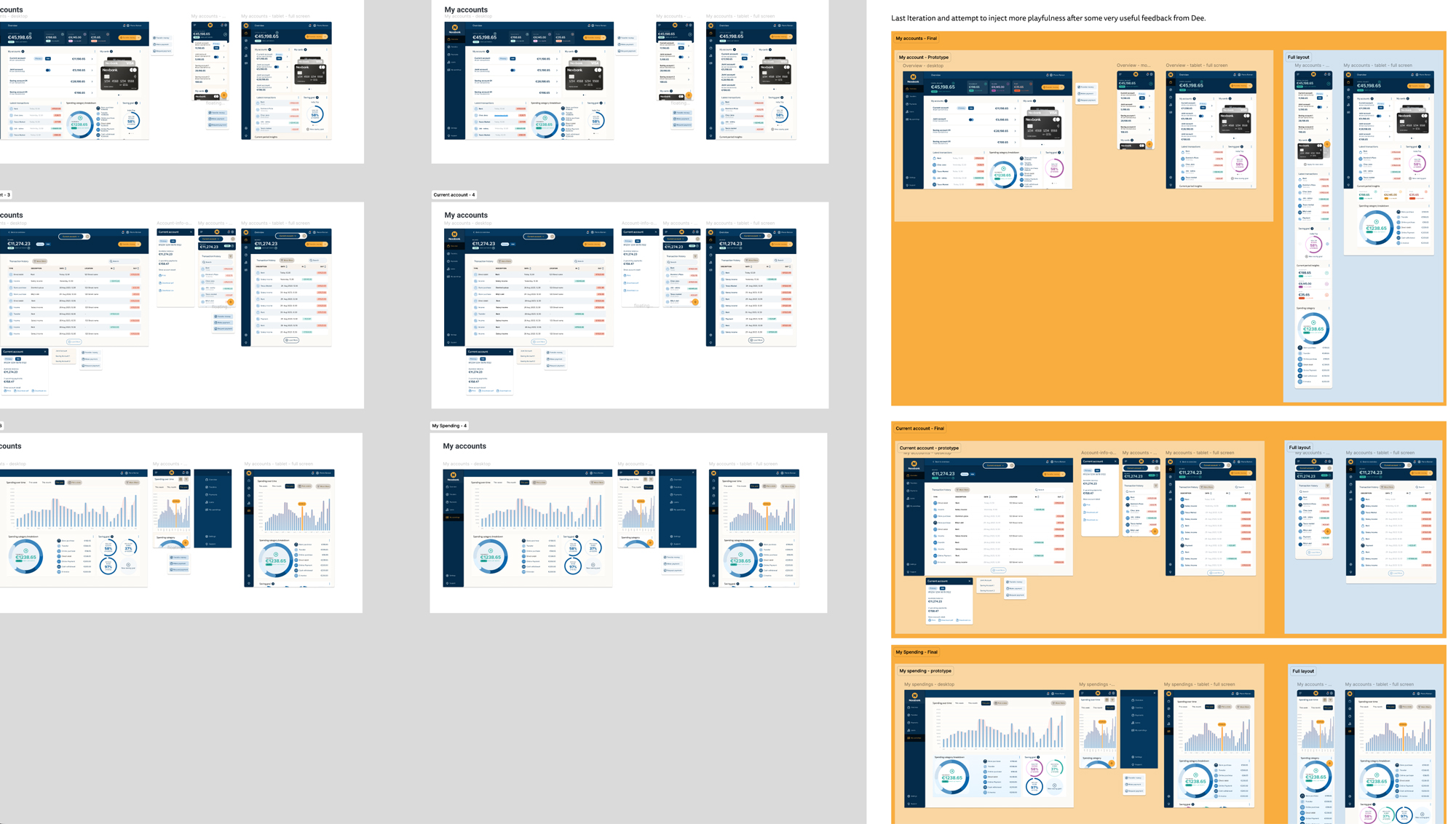
I designed the full product, overview, accounts, transactions, spending, across desktop, tablet, and mobile. The decisions adapt per breakpoint: the transaction table becomes a card list on mobile, the side navigation collapses into a drawer, the data-dense dashboard restacks without losing hierarchy. The card components, charts, and the account-detail patterns stay consistent throughout.
I own
Every layout decision and the call on what each breakpoint shows first versus reveals on demand. The component family that keeps the product coherent across all three.
The result
A product that reads as one brand and one system from the widest desktop to the narrowest phone, the design system proven by the screens, not just documented beside them.
Nexabank product UI across desktop, tablet, and mobile breakpoints

One decision, everywhere

Nexabank (UX Design Institute brief) · 2023

The thing I'm proudest of in Nexabank isn't any single screen. It's that one decision, made before I drew anything, is visible in all of them.

Trust is the substrate, play is the accent. I made that call at the moodboard stage, and then I held it, through the name, the logomark, the type scale, the colour rules, and every screen at every breakpoint. That's the part most portfolios can't show. It's easy to make one beautiful screen. It's hard to make a hundred decisions that all point the same direction, so the product feels like one thing instead of a pile of nice components.

You can trace the decision end to end. The logomark is geometric and bold (trust) with a long shadow that gives it warmth and motion (the accent). The type is crisp and tabular (trust) on a calm neutral base, with the vibrant colour released only into categories and savings goals (the accent). The transaction list is dense, aligned, and scannable (trust); the savings-goal rings and the spending donut are where the colour and delight live (the accent). The error copy is human; the navigation is utterly predictable. Every one of those is the same decision, applied again.

That's what "complete" means to me, and why I built this project. Not brand visuals in one file and UI in another, but a single chain of reasoning that runs from the company's name to the alignment of a number in a transaction row. A bank that feels human, because the accent is everywhere you'd want delight, and serious, because the accent never once touches the things you need to trust.

The logomark and identity showing the trust-plus-accent decision at the brand level
Product screens showing the accent confined to categories and savings while the structure stays calm

What it delivered

A brand built from nothing

The name Nexabank, the logomark, and a responsive identity system, designed from scratch, not styled onto a brand someone else made. The part of the work most UI portfolios never show.

A decision you can trace everywhere

Trust as substrate, play as accent, made once at the moodboard stage and held through every screen and breakpoint. Coherence by decision, not by accident.

A system that enforces the brand

A golden-ratio type scale, tabular figures for aligned balances, and an accent colour disciplined to categories and actions. The philosophy made structurally true, not just stated.

Complete, brand to breakpoint

One coherent project from the company's name to the narrowest mobile screen. Brand visuals and product UI as a single piece, the way it works when you actually launch.

Final Nexabank overview screen across breakpoints
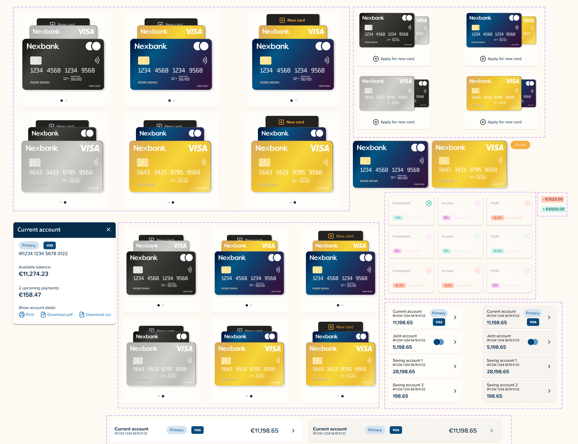
The Nexabank card component family and design-system foundations

This was a UI Design certificate brief, and I'm clear about that. But naming a company, designing its mark, building its system, and shipping a coherent responsive product on top is exactly the brand-to-product chain I'd run for a real launch, and most candidates can only show one end of it. If you're building something that needs the brand and the interface to feel like one decision rather than two teams, that's the work I do.

Ask the archive

Grounded in this site’s case studies and journal. It says when it doesn’t know. Questions are recorded so Loïc can see what the site fails to answer. Nothing else is stored.

About this assistant ↗