Work
EN FR
Case Study · Skyjetz (UX Design Institute brief) · 2023 · 9 min read

Booking is where airlines lose people. I designed the part everyone hates.

A complete UX process for a fictional airline, research to annotated handoff. Research named where booking conversion breaks, the seat picker answers it.

Client
Skyjetz (UX Design Institute brief)
Role
UX Researcher / Product Designer
Year
2023
Disciplines
UX ResearchSynthesisInteraction DesignPrototypingDeveloper Handoff
Booking is where airlines lose people. I designed the part everyone hates.

Most airline booking flows are where good intentions go to die.

Too many steps. Hidden mandatory costs. A seat-selection screen that feels built to confuse you into paying more. Users know it, and the research confirmed it: the most painful part of booking a flight isn't searching or paying, it's the stretch in the middle where you pick a flight and get funnelled through options you didn't ask for.

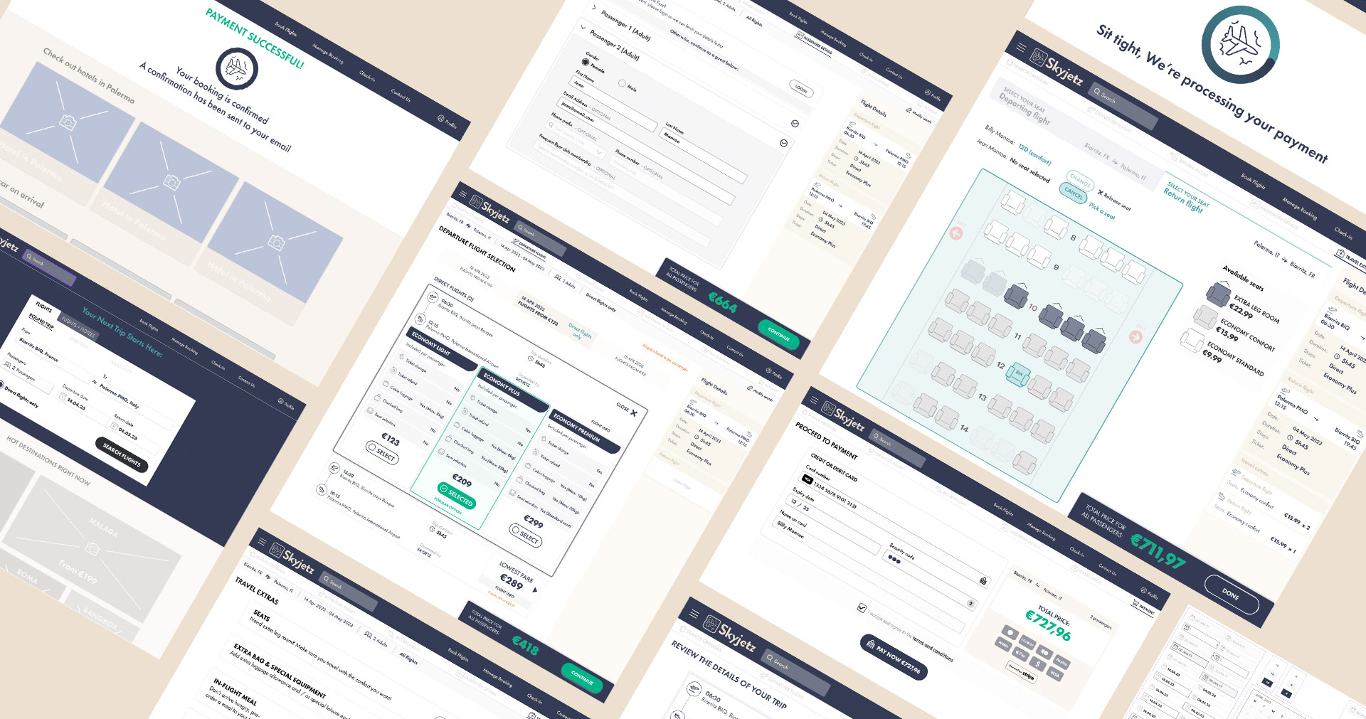
Skyjetz is a fictional start-up airline. The brief was to design its booking experience end to end, grounded in real user research. I took it as the chance to run the complete process without the compromises a live commercial timeline usually forces: benchmarking, survey, user testing, synthesis, flow design, prototyping, and a full annotated handoff, on one project. Fifteen years into the work, I rarely get to do every stage properly. This was that project.

This case study is built the way the work was: research first, decisions second, design third. The seat-selection microapp at the end isn't a separate showpiece. It's the proof that the research paid off, the answer to the exact pain the journey map identified.

A note on scope. The baseline booking flow was provided by the UX Design Institute. The research, the synthesis, the interaction design, the edge and error states, and the handoff are mine. This was a UX project, so the deliverable is mid-fidelity annotated wireframes and a clickable prototype, the flow, the states, and the interaction logic, not the visual design layer.

The research

Before designing anything, I needed to know where booking actually breaks. I ran three research methods and triangulated them.

Competitive benchmarking. I compared the booking usability of several best-in-class airlines, Air France, Air Canada, Norwegian, plus Google Flights as a wild card, across three areas: homepage, search and flight selection, and details and payment. The goal was to learn the conventions worth following and spot the bad patterns worth fixing.

An online survey. Quantitative and qualitative, to understand goals, behaviour, and pain. The findings that shaped the project: a clear majority booked on desktop rather than mobile, which set my primary focus to the desktop experience; 50% prioritised dates over price; and, most importantly, respondents named added options, seat selection and baggage, as the single most painful, least transparent part of booking. In their words: too many steps before checkout, and prices that hide mandatory costs until late.

User testing and depth interviews. Three sessions I ran (two remote, one in person) plus two recorded sessions I reviewed in detail, across four airlines. The recurring findings: information overload, features that confuse without explanation, uncertainty about whether a price covered one passenger or several, and a booking process that was simply hard to follow.

Three methods, one consistent signal. The next job was to turn a pile of findings into a direction.

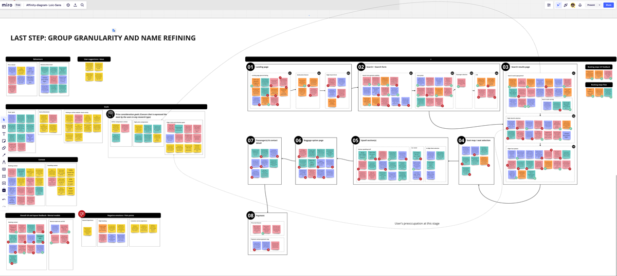
Affinity diagram clustering research findings into booking-flow stages, a working artifact

The synthesis

Raw research isn't a direction. A list of findings is a list of findings until something forces a decision out of it.

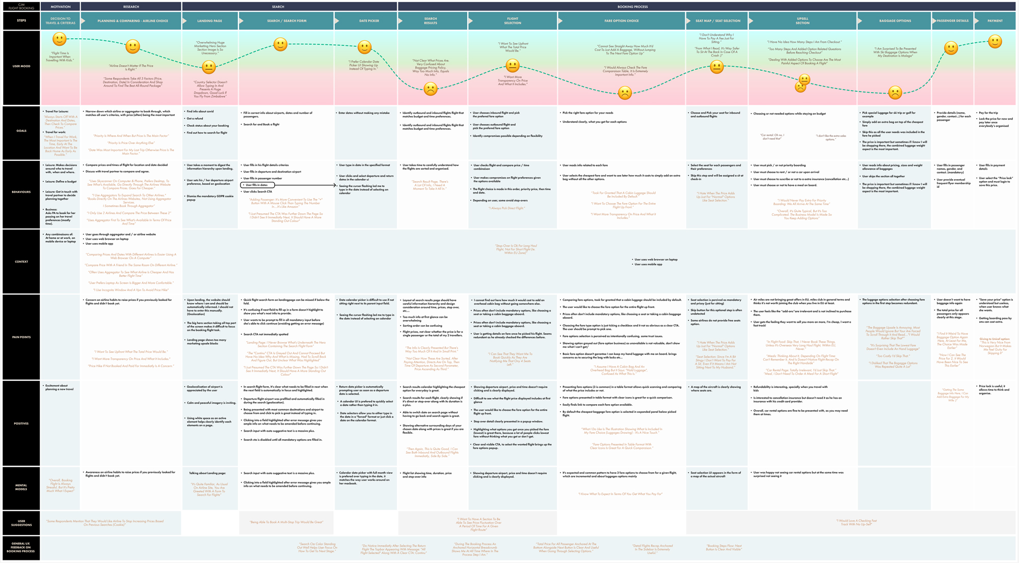
I clustered every observation onto individual notes and grouped them by triangulation, first into the stages of the booking flow (search form, results, flight selection, upsell, checkout), then into finer subgroups like the date picker and the flight card. Sequencing those clusters in booking order turned directly into a customer journey map, with goals, behaviours, positive moments, and pain points at each step, quotes from the usability tests pinned where they landed.

The journey map confirmed the spine of the whole project. Across every stage, one zone stood out as the most painful by a clear margin: search results, flight selection, and the upsell. The upsell in particular was described as unnecessary and annoying, the place where users felt the booking turn against them.

That synthesis is what gave me a focus instead of a wishlist. The design effort would concentrate where the pain was densest, the middle of the flow, and treat the upsell not as a revenue add-on to tolerate, but as the hardest UX problem to solve honestly. Every design decision after this point traces back to that one conclusion.

STAGE 01

From findings to a focus

The problem
Raw research isn't a direction. Three methods produced a mountain of findings, and a mountain of findings is not a design brief. Something had to force a decision out of it.
The method
I structured everything through triangulation into an affinity diagram, then sequenced the clusters in booking order to build a customer journey map, goals, behaviours, positive moments, and pain points at every step, with usability-test quotes pinned where they belonged.
I own
The synthesis call. Reading the clustered data and the journey map and naming the one zone that mattered most, rather than spreading the design effort thin across everything users mentioned.
The result
A single, defensible focus, search, flight selection, and the upsell, identified as the most painful zone by a clear margin. A focus, not a wishlist. Every later decision traces back to it.
Customer journey map identifying search and selection as the most painful zone, a working artifact
STAGE 02

A flow you can always locate yourself in

The problem
Booking is multi-step by nature. Users get lost, lose confidence, and abandon when they can't tell how far through they are or what's coming next.
The method
From the journey map I built the flow diagram, then designed the booking flow around a persistent progress indicator anchored below the header, showing completed steps, the current step, and what remains, across all eight stages from search to confirmation. Every screen keeps the user oriented.
I own
The flow architecture and the decision to make progress legible at every step. The eight-stage structure and the branching within it, guest versus login, no-flights recovery.
The result
A linear flow with no dead ends, where the user always knows where they are and what's left. Orientation designed in, not bolted on, and traceable straight back to the journey map.
Booking flow diagram, eight stages with guest/login and no-flights branches
STAGE 03

A payment form that catches errors before the bank does

The problem
Payment is where abandonment is most expensive. A form that rejects input late, or unclearly, loses the booking at the last metre.
The method
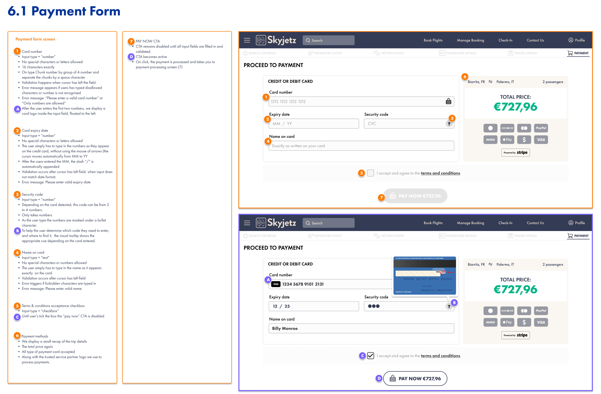
I specified the payment form down to interaction detail for developer handoff. Card number restricted to digits, chunked in groups of four with spaces, validated on blur with specific error copy, and card-type detection that floats the issuer logo into the field after the first digits. Expiry auto-appends the slash between MM and YY. CVC is masked with a contextual tooltip showing where to find it. The Pay CTA stays disabled until every field validates and terms are accepted.
I own
Every validation rule, error message, input constraint, and the timing of when feedback appears. The connective tissue most flows leave to chance.
The result
A form documented so completely a developer could build it without a single guess, and a user gets corrected gently, in place, before anything fails. See full specs handoff document here
Annotated payment form specification with validation rules and error states
STAGE 04

Designing for the moment it goes wrong

The problem
Most flows design the happy path and forget that payments fail, flights sell out, and servers stall. That's exactly when a user is most likely to leave for good.
The method
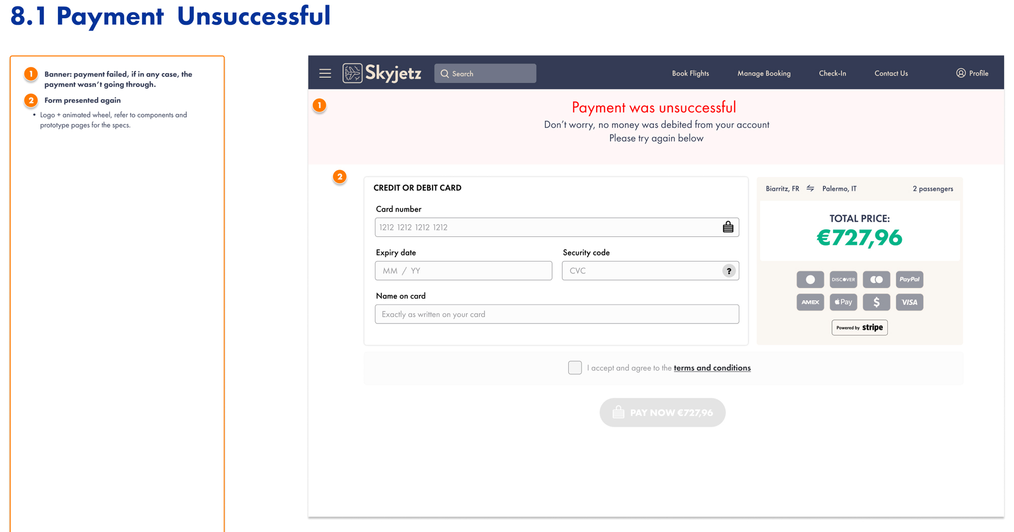
I designed the failure and edge states as first-class screens. Payment unsuccessful leads with reassurance (Don't worry, no money was debited from your account) and re-presents the form for an immediate retry. No flights available offers an adjacent-date selector instead of a dead end. Processing states cover the gaps while search and payment resolve.
I own
The decision to treat error recovery as a designed experience, the reassurance copy, the recovery path, the choice never to leave a user stranded.
The result
A flow that holds together when things break, which is the only time a booking experience is really tested. See full specs handoff document here
Payment unsuccessful screen with reassurance copy and recovery path

The upsell, made honest

Skyjetz (UX Design Institute brief) · 2023

The research had named the villain: the upsell. Seat selection specifically, the moment users said the booking stopped feeling honest. So the seat picker became the part of the project I most wanted to get right, because solving it meant solving the thing the journey map flagged as worst.

The answer was a self-contained seat-selection microapp, launched from the travel-extras step. Not another page in the chain. A focused module with its own internal logic, designed to make the most resented part of booking the most transparent.

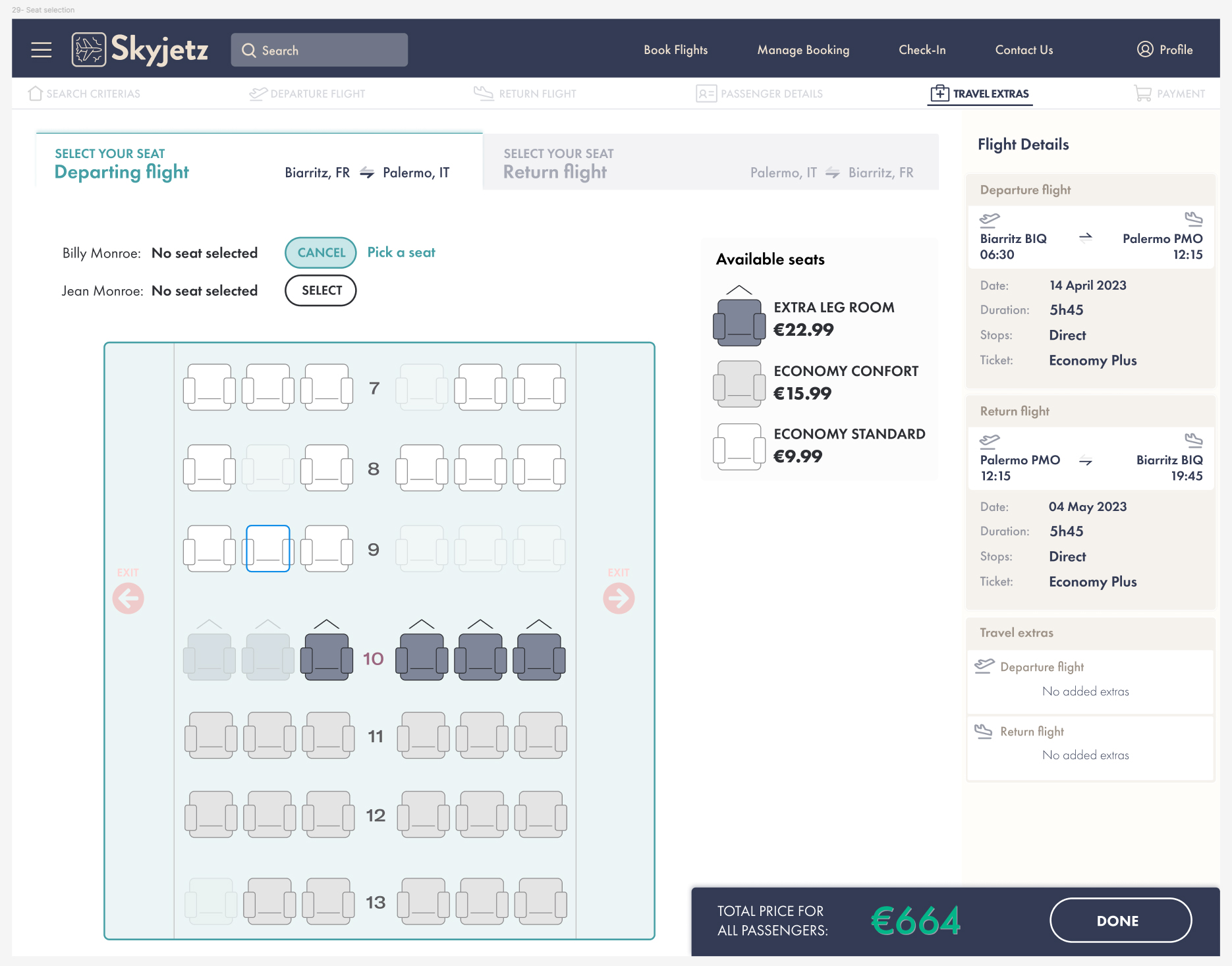
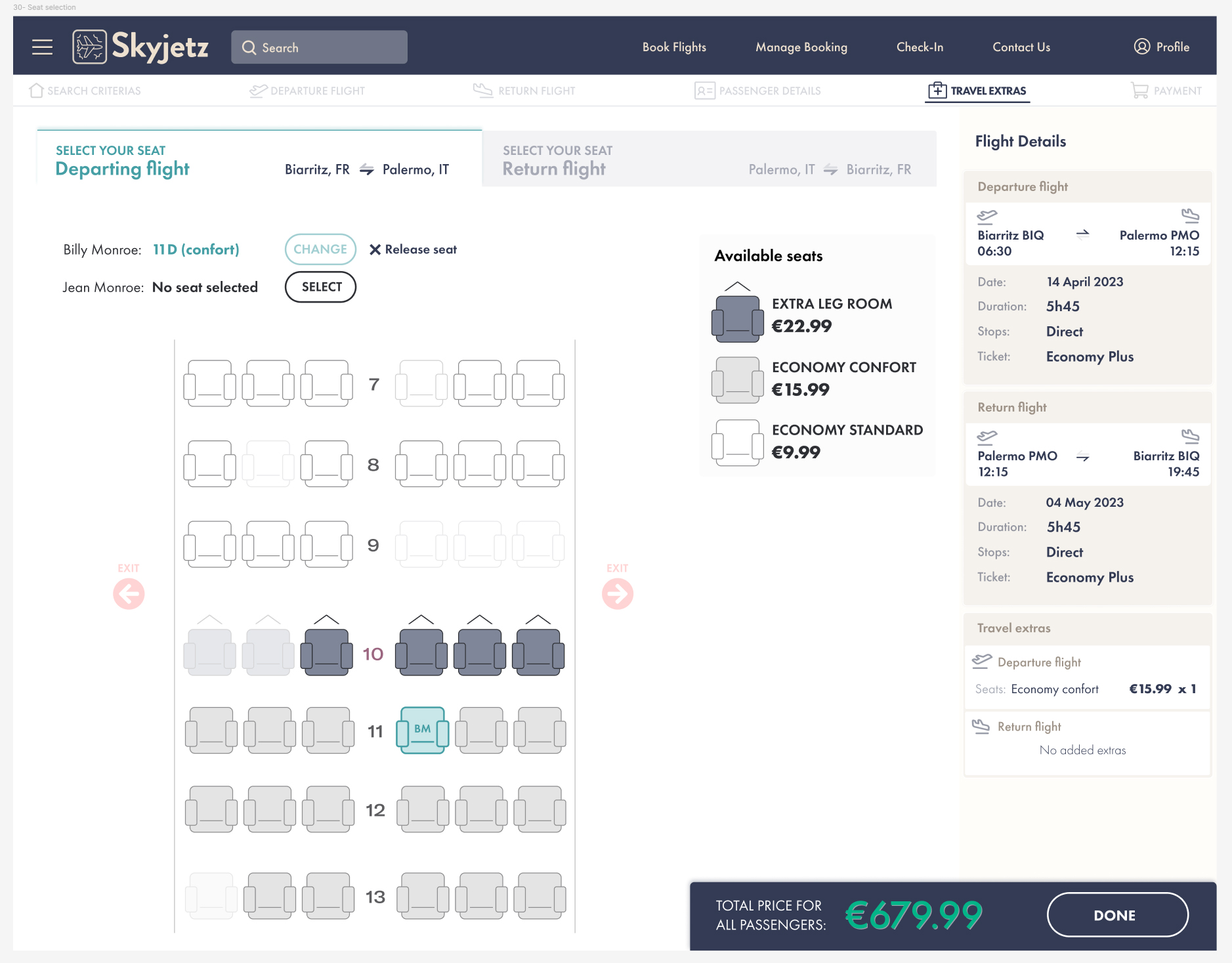
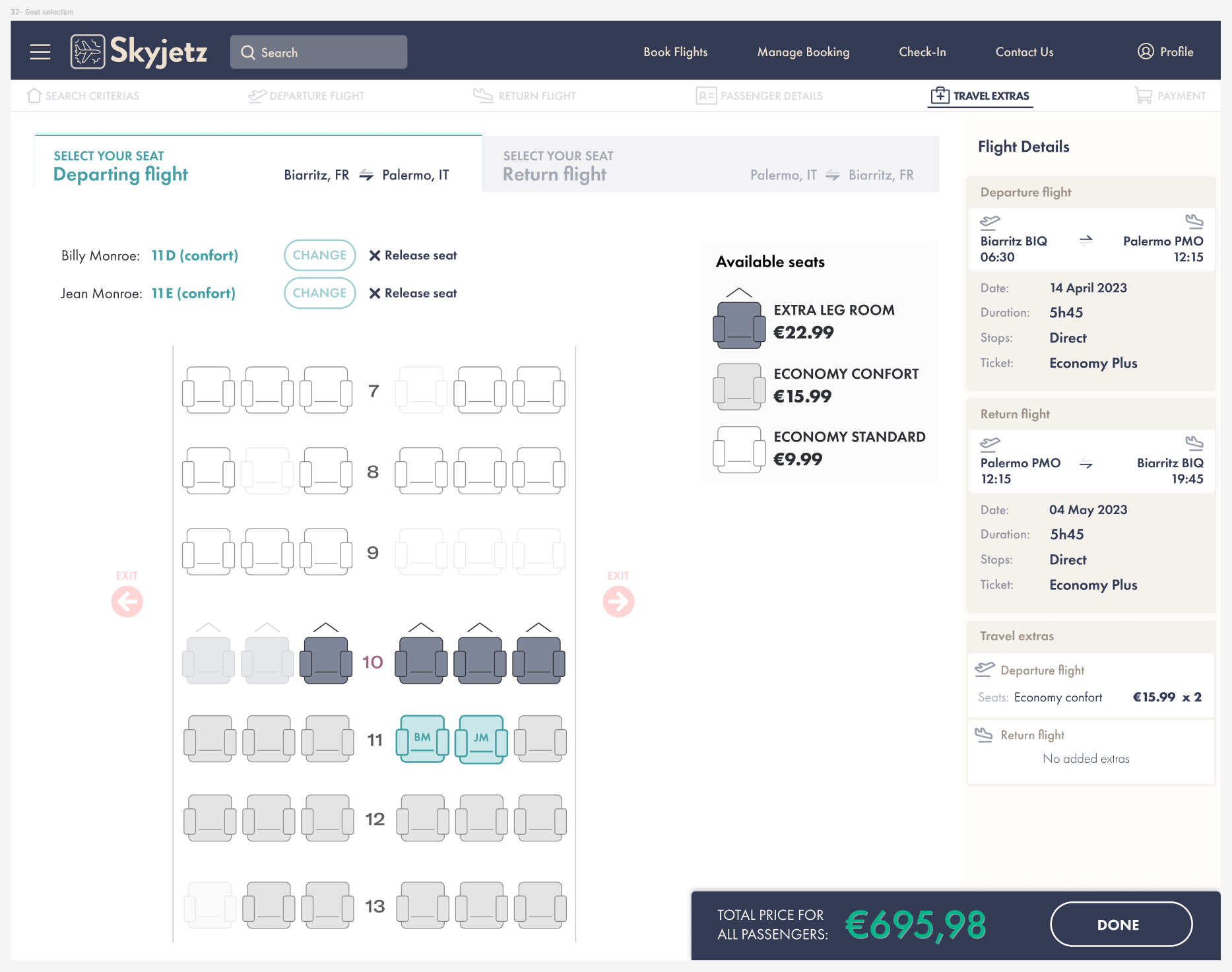
Here is what it actually had to handle. Two passengers, two legs of a round trip, four independent seat decisions. Each passenger has their own selection track with three states: no seat selected, actively choosing, and seat confirmed. Click Select and the button becomes Cancel while a pick-a-seat prompt and the seat map both highlight, the interface tells you it's your turn to act. Pick a seat and the state flips again: the button becomes Change, and a release-seat control returns the passenger to the default. One passenger can be fully booked while the other still reads no seat selected, and the flow handles that partial state without complaint. The same workflow repeats for the return leg in its own tab.

Three fare tiers, Extra Legroom, Economy Comfort, Economy Standard, are stated openly in the panel, with the price visible at every step. The anchored bar shows the running total for all passengers, updating live as seats are added (664 euros, then 679.99, then 727.96). The flight-details sidebar itemises every charge by passenger and by leg. Nothing is hidden until checkout. Nothing is a surprise.

That is the research paying off. The journey map said seat selection is where booking feels deceptive. So I designed the version where the price is never hidden, the state is always clear, and the user is never tricked into anything. The upsell, made honest, because the research told me exactly which moment to make honest.
Seat microapp in selecting state, button switched to Cancel and seat map highlighted
Seat microapp with one passenger seated and one still unselected, sidebar reflecting partial state
Seat microapp with seats confirmed for both passengers across both legs, running total updated

What it delivered

A complete process, start to finish

Benchmarking, survey, user testing, affinity diagram, journey map, flow design, prototype, and annotated developer handoff. Every stage of the UX process, run properly on one project.

Synthesis that picked the battle

The decision to focus on search, selection, and the upsell wasn't a hunch. The affinity diagram and journey map identified it as the most painful zone, and naming that focus is the call every later decision rests on.

The upsell, made honest

The seat microapp turned the most resented part of booking into the most transparent. Open pricing, clear state, a live running total, and no hidden costs, a direct answer to the journey-map finding.

A handoff with no guesswork

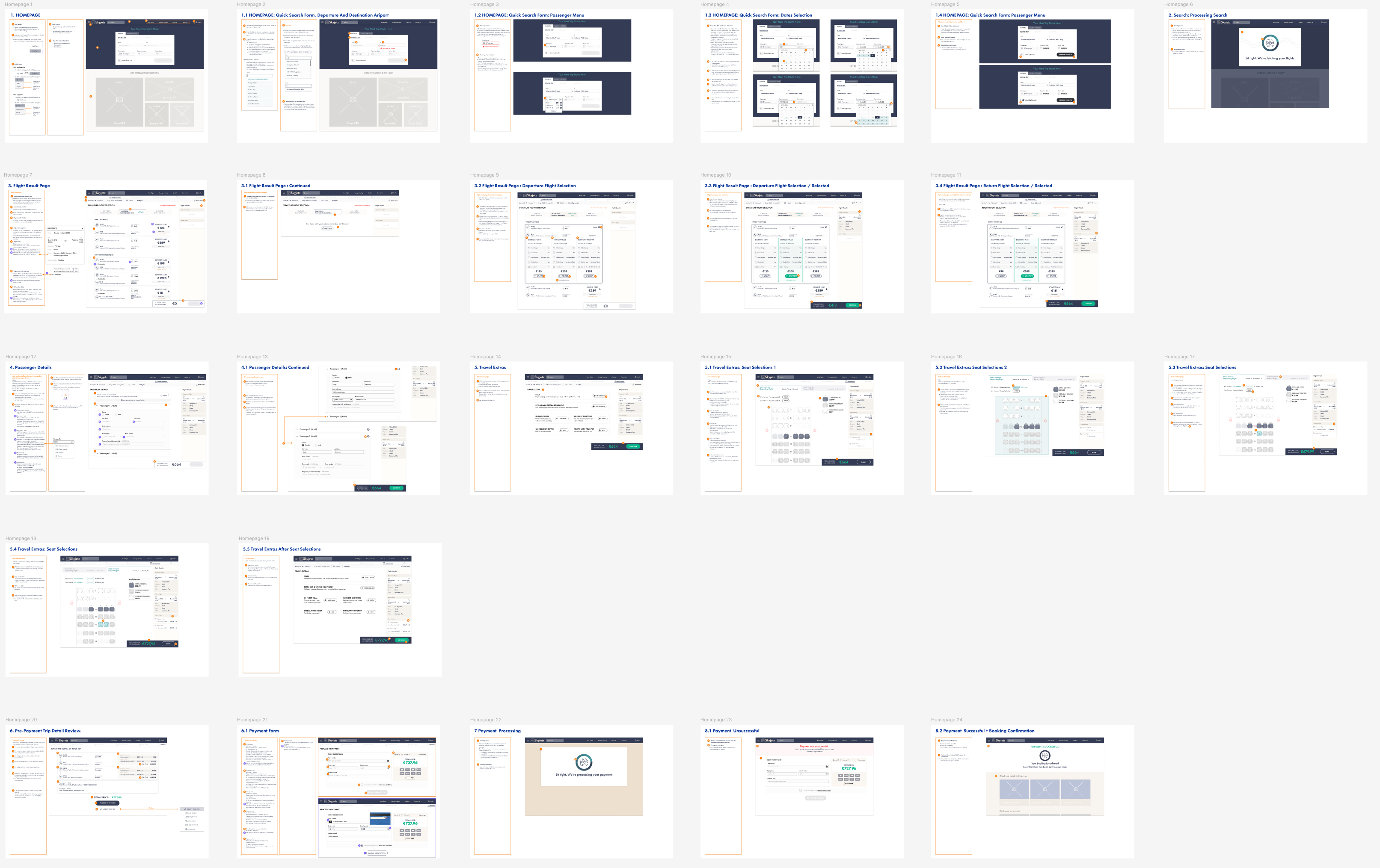
Every page, component, screen state, error message, and interaction documented for engineering. The kind of handoff that gets built as designed.

The annotated wireframe handoff, every screen, state, and interaction documented

This was an academic brief with a fictional client, and I'm clear about that. But the chain behind it, research to synthesis to a single focusing decision to design, is the one I run on real products, and the seat microapp is the kind of interaction problem, multi-state, multi-passenger, commercially loaded, that separates arranging screens from designing systems. If you're building a flow where the hard part is making a complicated, money-touching moment feel honest, that's the work I do.

Ask the archive

Grounded in this site’s case studies and journal. It says when it doesn’t know. Questions are recorded so Loïc can see what the site fails to answer. Nothing else is stored.

About this assistant ↗