Nine countries. One screen. Every indicator in view.
How I designed a monitoring dashboard that pulled UNICEF's WASH programme out of scattered spreadsheets into a single, evidence-driven view of nine countries.
UNICEF's West and Central Africa Regional Office (WCARO) runs a WASH programme, water, sanitation, and hygiene, across nine countries. Every country tracks its progress against a framework of indicators. The data was being collected. The problem was that no one could see it in one place.
A programme manager who needed to know how the whole region was performing, and decide where limited funding should go, had no single view to look at. The answer lived in nine separate systems, maintained by nine separate teams, in nine separate files.
I was brought in by our Akvo product manager to design the dashboard that would put it all on one screen.
Before any design, I had to understand the real cost of the status quo.
Across all nine countries, monitoring and evaluation officers were tracking their indicators in Excel and Word documents. Each file was its own island. To assemble a regional picture, someone had to manually pull from every country, reconcile formats that never quite matched, and rebuild the overview by hand, every time a decision was due.
This is slow, but the deeper problem isn't speed. It's that evidence-based decisions were being made on evidence that nobody could actually see at once. The data was real. The ability to act on it was not.
The brief I was given was narrow and the timeline was tight. I joined after the kickoff, with no involvement in the original client conversations, so my first job was to get past the brief and to the people who would actually use this thing.
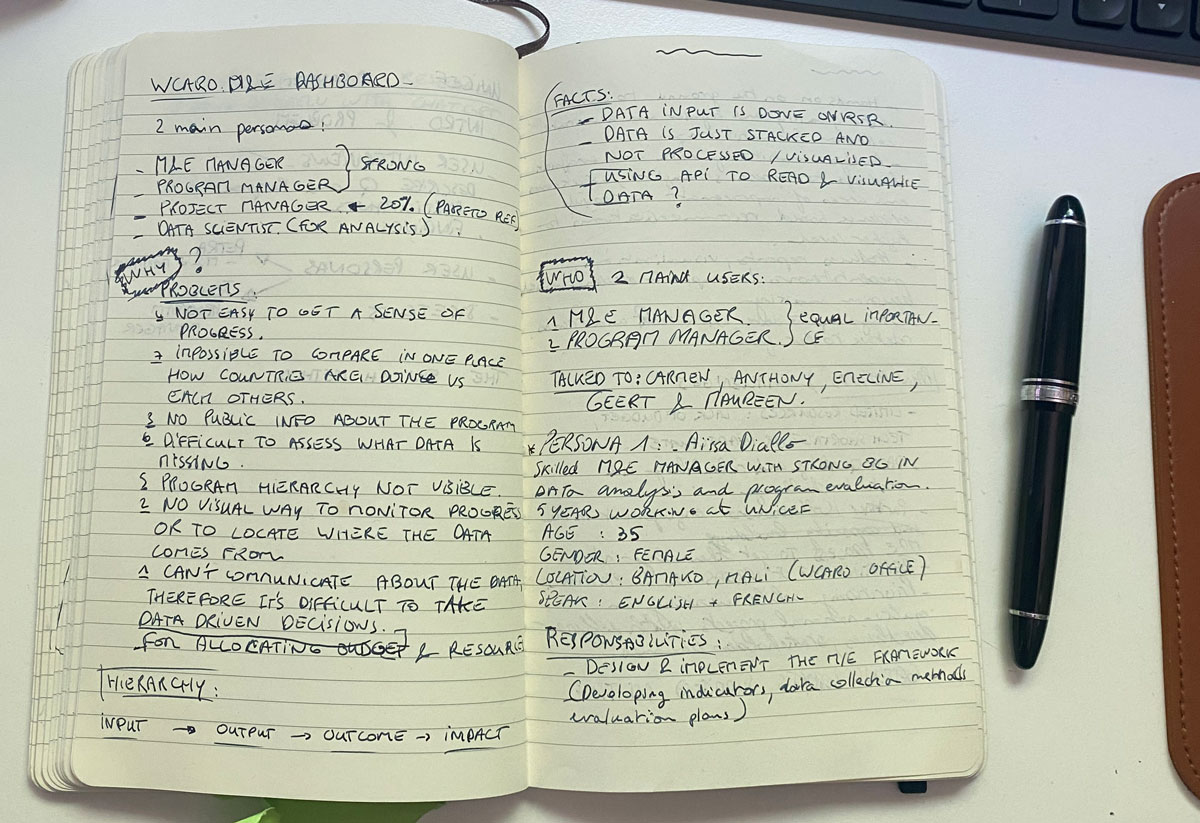
When I walk into a project with no background and a tight scope, I anchor the research on a simple frame borrowed from journalism, 5W1H. It keeps me honest about the problem before I start solving it.
I ran six in-depth remote interviews across those three groups. The questions probed how they assess progress today, what tools they use, where the pain is, how they handle missing or inaccurate data, and how they decide which project gets limited funding when there isn't enough to go around.
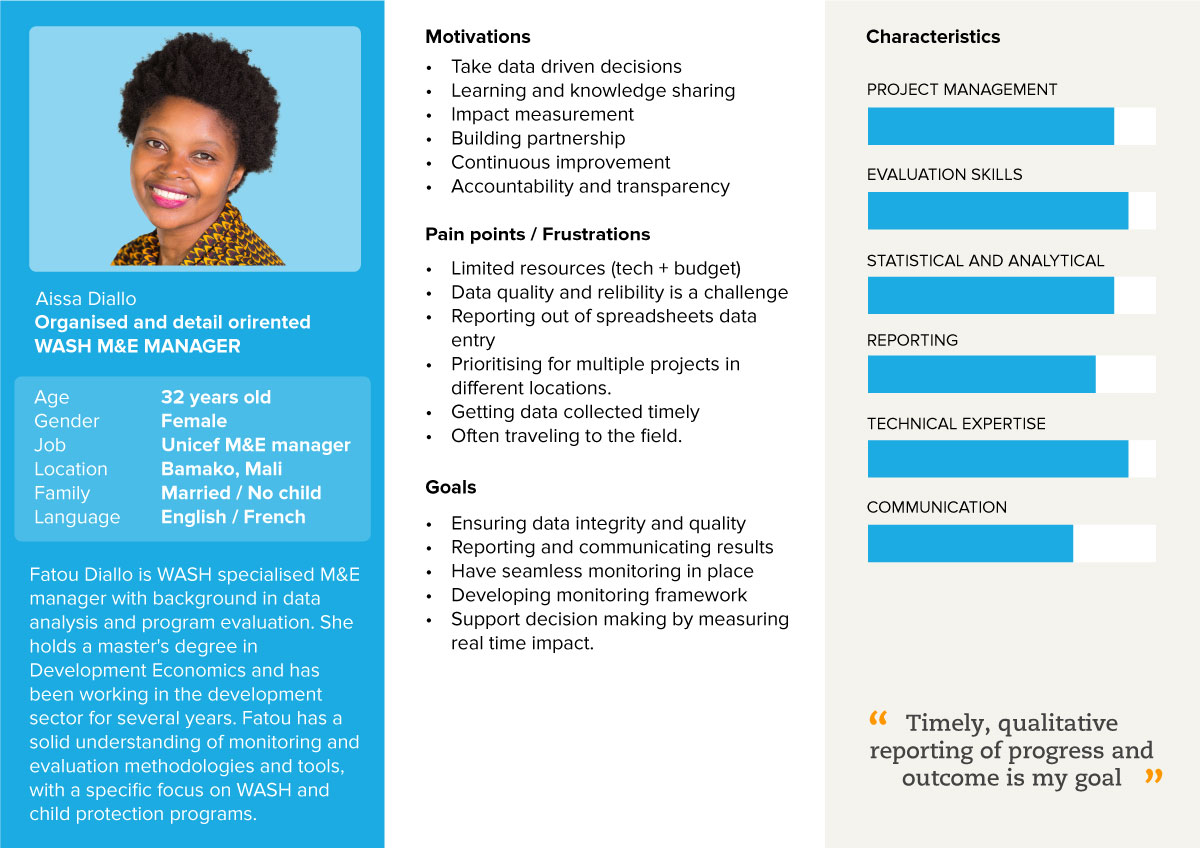
Two personas came out of it, the decision-maker and the framework-keeper, with genuinely different needs from the same screen. That tension became the central design problem.
The moment the project turned was the moment the structure clicked.
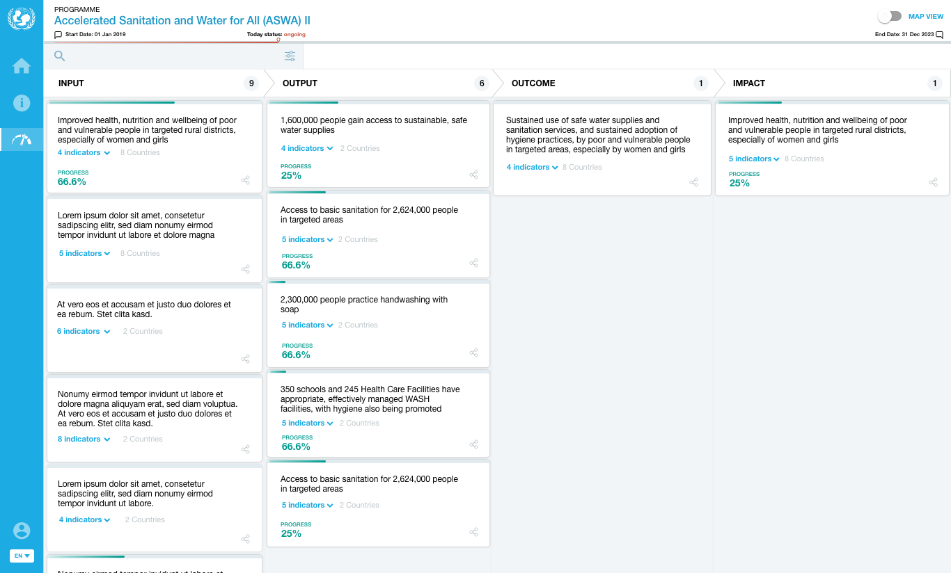
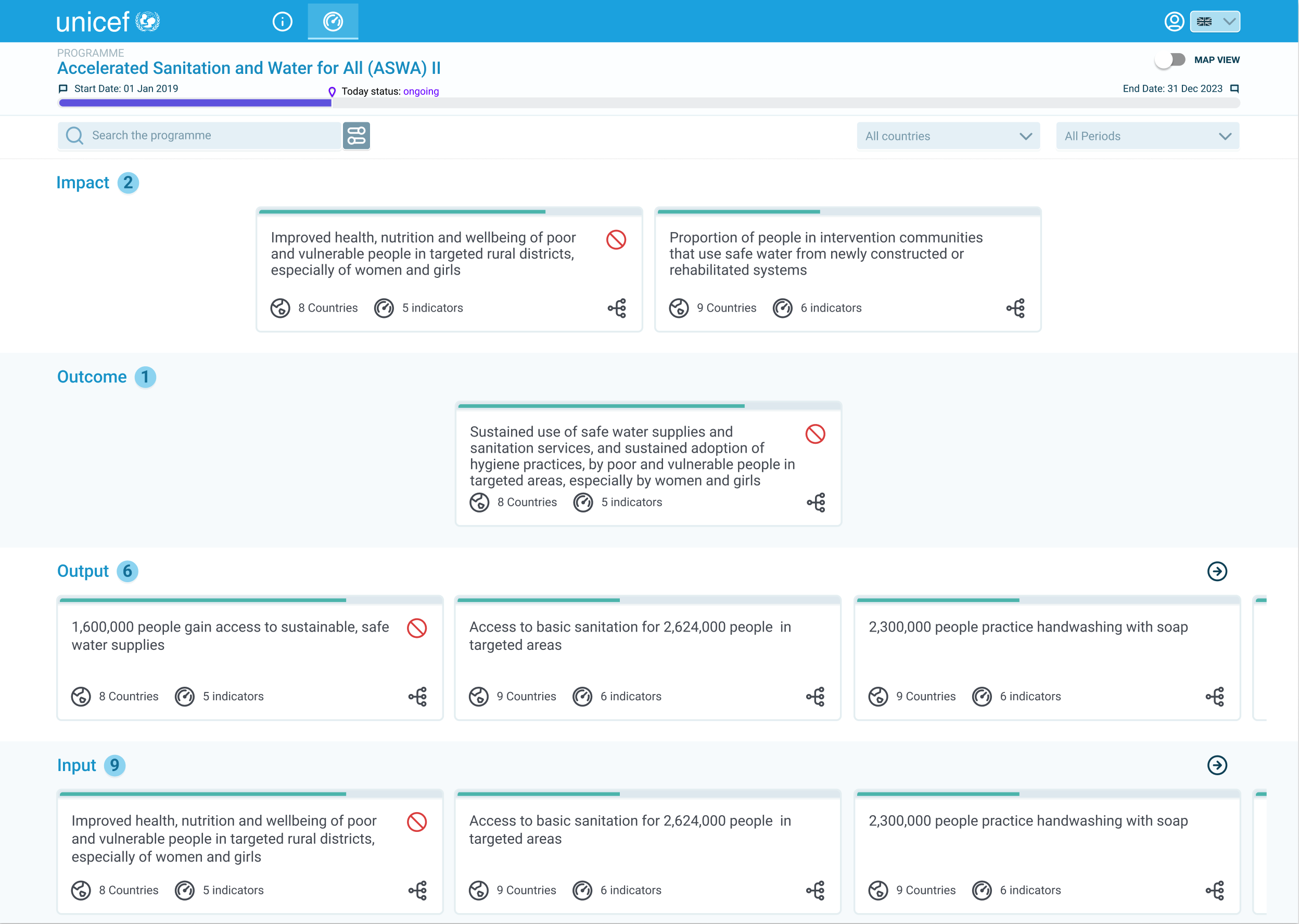
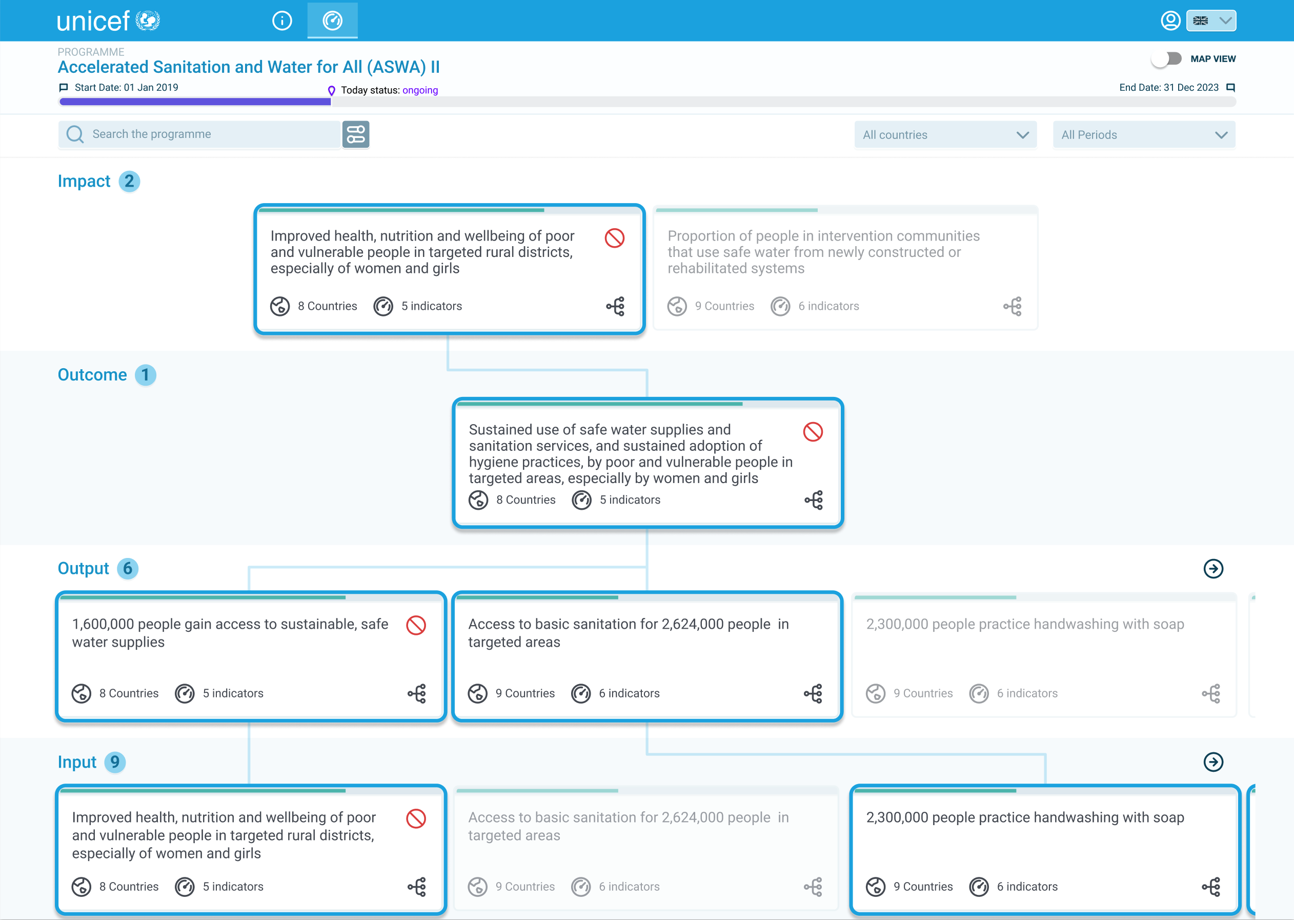
For a while, the dashboard fought me. I had the research, the personas, the data hierarchy, and a tabular layout that organised all of it correctly and communicated none of it. Users could read the rows. They couldn't feel the shape. And the shape, INPUT to OUTPUT to OUTCOME to IMPACT, was the entire point. It's how M&E people think. A dashboard that hides it is just a spreadsheet with better fonts.
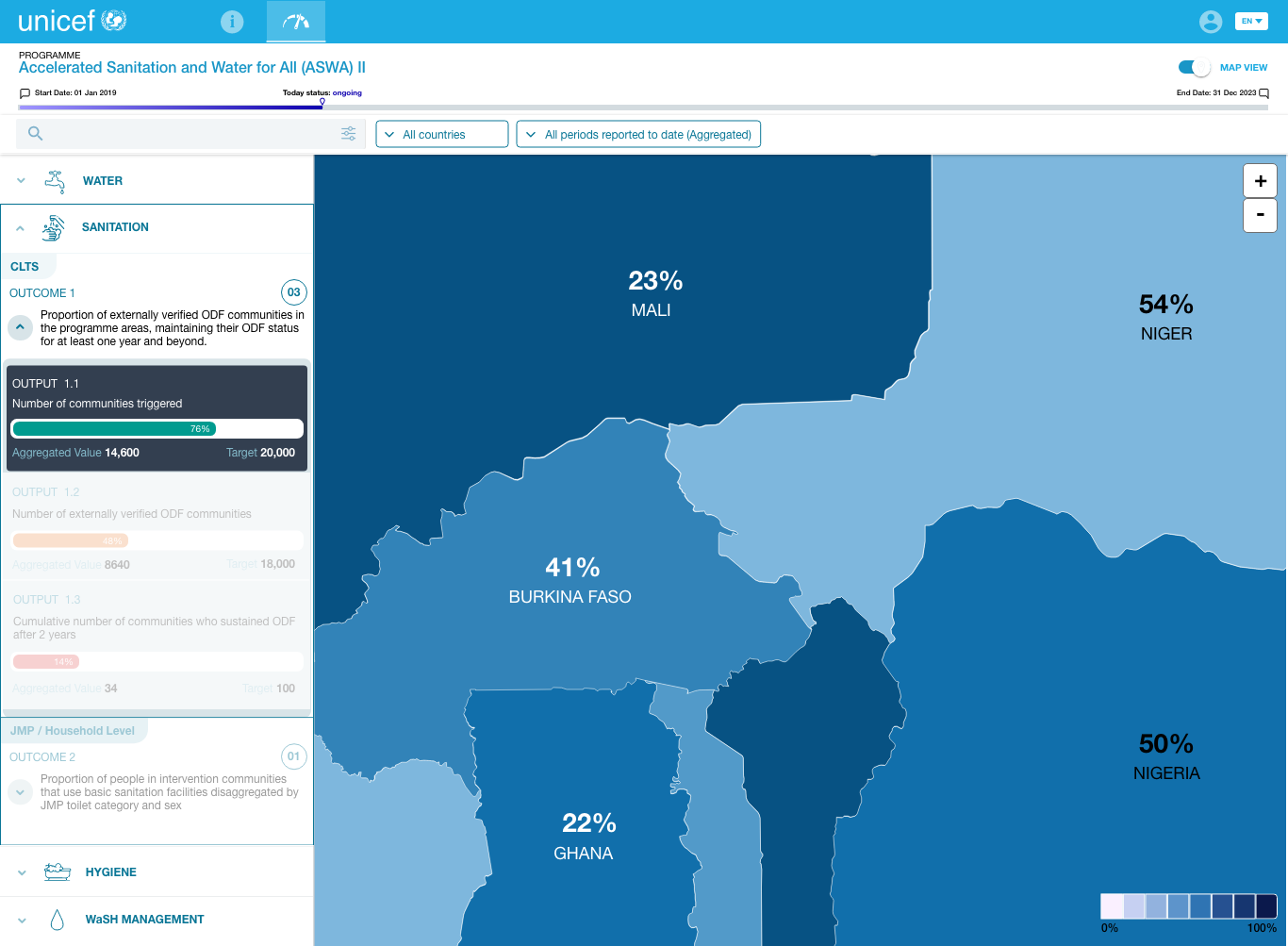
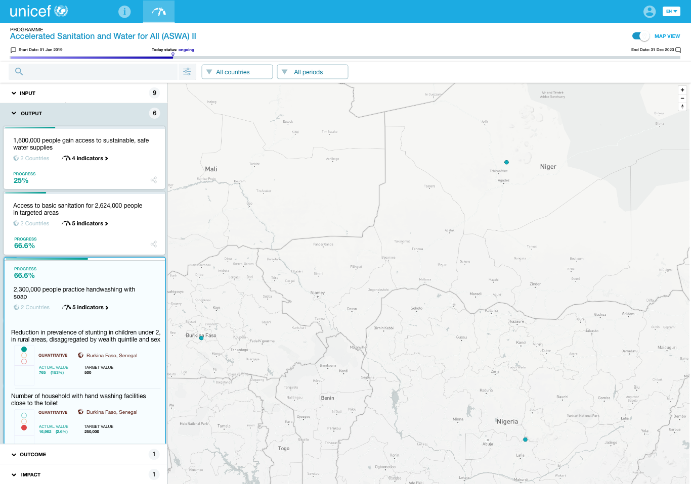
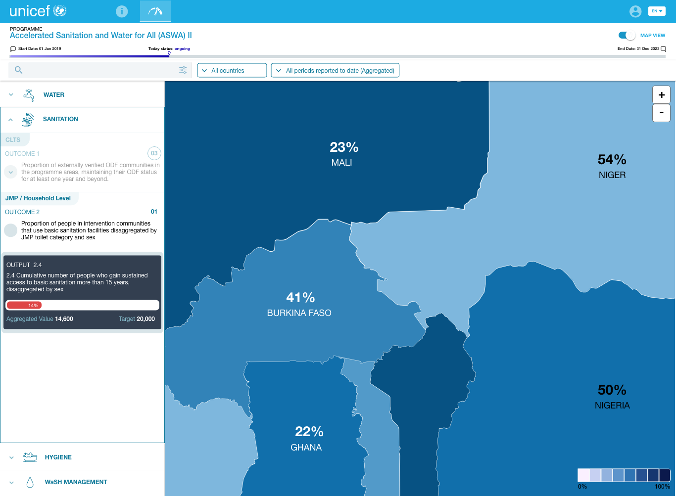
When I switched to a tree structure, the whole thing resolved. The hierarchy became visible. A manager could see, at the top level, how a country was performing, then expand into the activities underneath without losing the thread. The map carried the regional status; the tree carried the logic.
This was the pain that started the project, stated by an M&E manager in the very first conversation. The dashboard's job was to make that sentence obsolete. Once the tree structure landed, it was.
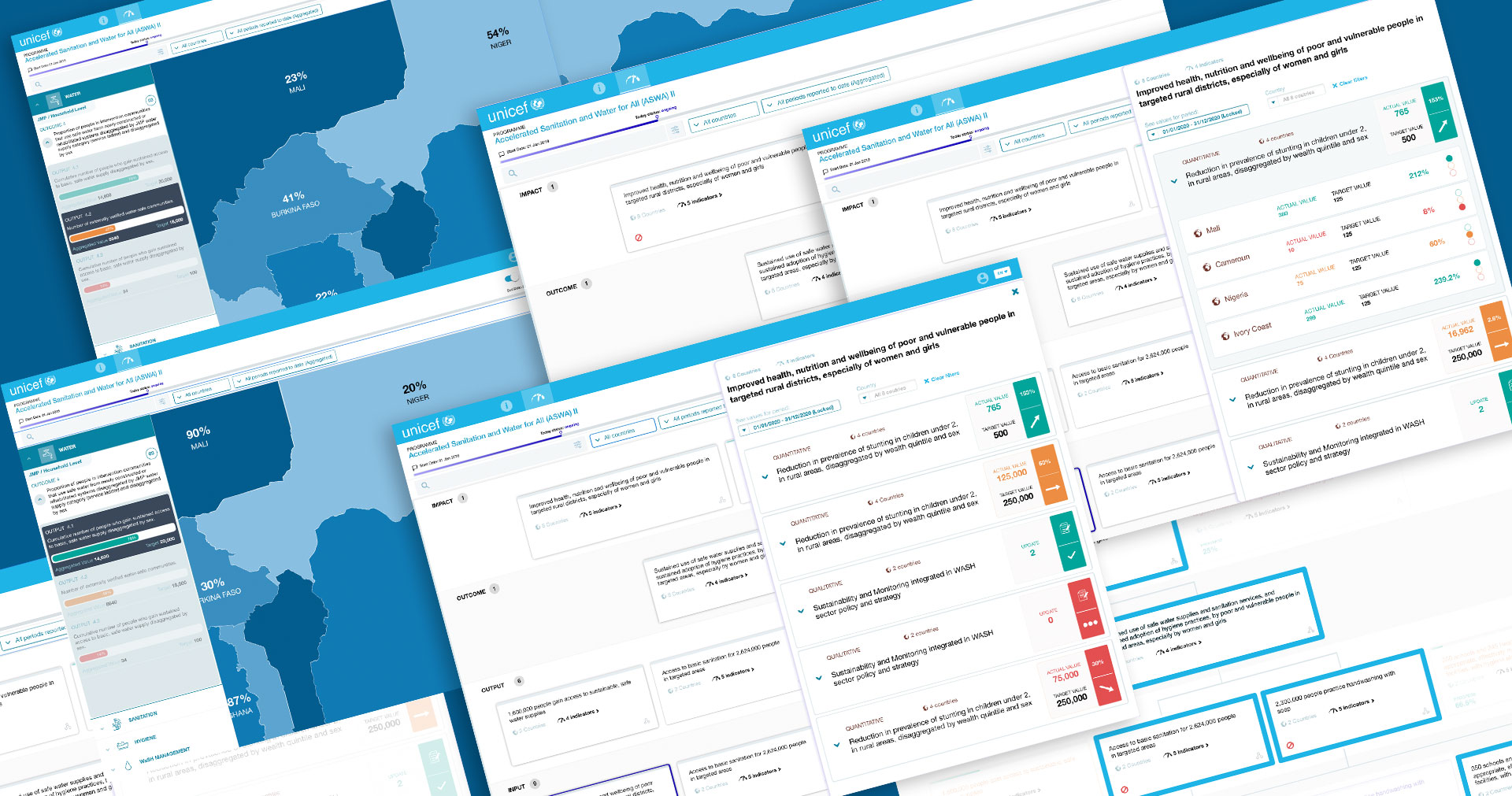
The research told me what people needed. The structure is what finally let them see it.
The dashboard was implemented and used for the full length of the WCARO programme, replacing the scattered Excel and Word files that came before it.
For the first time, a programme manager could open one screen and see regional progress, instead of assembling it by hand from nine separate systems.
The shift from a tabular layout to a tree structure turned a correct-but-flat dataset into something that read the way M&E specialists actually think, INPUT to IMPACT, at a glance.
With regional status legible in one place, funding and resource calls could be made against evidence managers could actually read, which was the problem the project set out to solve.
This was internal decision-support tooling, so success wasn't a conversion metric, it was whether managers could finally act on evidence they could see. They could. If you're building a product where the hard part is making complex data legible enough to decide on, let's talk.